
AppScrobbler: A mobile application giving users insight into their app usage
This is the topic of my bachelor thesis I wrote at the Ubiquitous Media Technology Lab of the German Research Center for Artificial Intelligence (DFKI) in Saarbrücken, Germany, in the winter term 2013 / 2014.
These days, the distribution of smartphones and app diversity keep growing so that the numbers of apps and downloads are constantly increasing. But do users know how much time they actually spend on apps per day? This work involved the development of an Android application which should give users insight into their own app usage. It was part of the AppScrobbler project, which attempted to understand smartphone usage in context for different services.
For the development of the app, the most comprehensible data visualisations needed to be discovered in order to allow users to draw sound conclusions. Data visualisation ideas were sketched on paper.
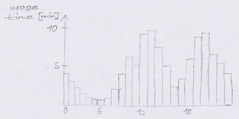
Sketch showing the average usage time of an app per hour as bar chart
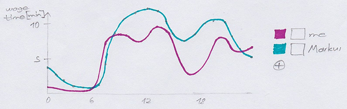
Sketch showing your and your friend's average usage time of an app per hour as curve chart
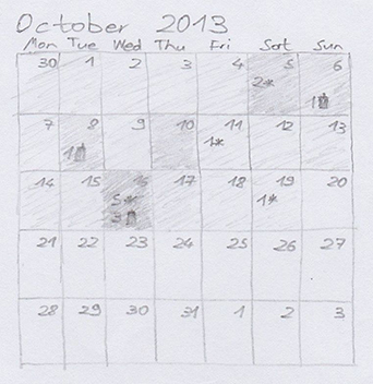
Sketch of a month view of a calendar with days coloured by phone usage intensity and with app installations and removals indicated as small icons with numbers of occurrences
Then, these sketches were evaluated through a study which consisted of an informal, open-ended interview. Visualisations showing the most used apps, reachability information and stereotypes seemed very popular. However, there was a common lack of interest in the number of installed apps. Most participants raised privacy concerns, mainly about the constant location tracking. Some also wished to hide particular apps from their friends. Before the implementation, the user interface was designed using wireframes.
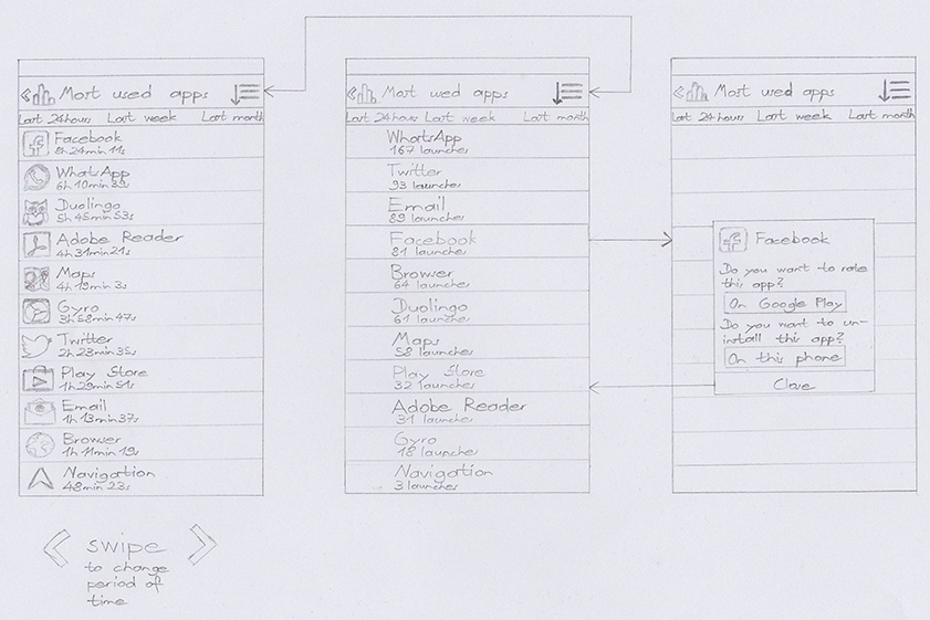
Most used apps lists; A touch on the icon in the action bar changes between ordering the lists by usage time (on the left) and launch frequency (in the middle). A tap on a row opens the app dialog (on the right).
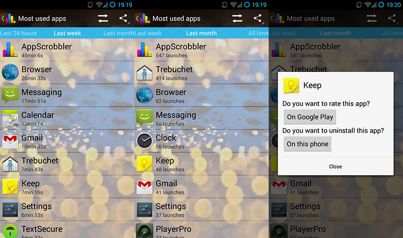
Screenshots of the most used apps views
Several test versions were deployed and the received feedback owed into the further development following the iterative design process. Finally, the app was ready to be released to the public, but never was due to licensing issues of the underlying library.
Feel free to have a look at the complete thesis or at the slides of its work in progress presentation.